Beginner’s Pluck: Chip Kidd's GO
This book review was written almost a year ago, having been commissioned by the editors of The Common Reader, a new Washington University journal. The publication is to have online and print dimensions, as I understand it. It took the awhile to iron out the kinks; the Reader site debuted in the fall.
The review appears at (on?) the Reader here, dated October 1, 2014. I'm posting it in this space for GT readers.
By the end of the 20th century, graphic design had come to occupy a dominant position in modern visual culture. Once the domain of ancient scribes, then of type-founders and printers, until relatively recently the activities we associate with graphic design were manual, concrete and restricted by laborious printing processes. But after 1940, photomechanical reproduction and offset lithography–coupled with modernist aesthetics–offered graphic designers and art directors new range and flexibility. During the Postwar period, design for print (advertising, books and periodicals) got more ambitious and visually rich. Fifty years after that, the advent of digital technology launched another new era, providing designers with comprehensive software tools. The design process was revolutionized in the 1990s by Quark, now almost totally supplanted by Adobe inDesign. The software accelerated everything. It also made working with type and images (by historical standards) mind-bogglingly plastic. Both factors–speed and plasticity–subtly de-emphasized the prior roles played by photographers and illustrators. The graphic designer had always managed the design process, but now she controlled the means of production in a new way, and the process to a new degree. The concept of “designer-as-author” emerged in this period. (The very same software created a popular illusion: that Quark and its descendants could provide good-design-in-a-box, producing waves of work by untrained designers, yielding new forms of contemporary ugliness.)
The methodologies of design practice have matured. Once associated with “making things look good,” designers now bring well-developed strategic skills to their work. Their methodologies, which are highly iterative and non-linear, have been brought to bear on projects well beyond the visual. Designers engage truly knotty problems, exemplified by human-centered design firms like IDEO. Indeed, today’s “designer” is as likely to configure experiences as to generate things.
Seen in this light the term graphic design sounds increasingly outdated. Paradoxically, just as graphic designers achieved final cultural pre-eminence among their fellow visual communicators in print, the field has diversified beyond recognition. New and growing fields like interaction design, data visualization, and multi-platform design for devices have irrevocably changed the professional landscape.
That said, Chip Kidd’s new book on graphic design provides a welcome overview for young people. GO: A Kidd’s Guide to Graphic Design attempts to describe the field, but more valuably demonstrates a visual sensibility while supplying some basic vocabulary for novices. I would have been very glad to read this book many years ago in early adolescence, just to have names put to things otherwise unseen, or taken for granted.
That such a book was conceived and has been published to some acclaim now underscores the popular status of design today. The emergence of an auteur like Kidd was unimaginable before the digital age. Designers like David Carson (born 1954; associated with the magazine Ray Gun) and Tibor Kalman (1949-1999; also associated with a magazine, Benetton’s Colors) were among the first such pop star designers–although both of them were associated with more aggressive cultural stances than Chip Kidd.
Kidd has enjoyed an extremely successful career in graphic design, specializing to an unusual degree in book jackets. His projects are consistently inventive, visually fulsome and marked by a strong sense of the rhetorical. The intelligence and sure-handedness of his work with images are truly striking. In an effort to establish his bona fides with young readers, he cites his long collaboration with Michael Crichton, whose covers he designed. In addition to Jurassic Park, other iconic Kidd covers include Robert Hughes’ The Shock of the New, Oliver Sacks’ books and reissues of the Japanese cartoonist Osamu Tezuka’s graphic novels. He’s worked with comics publishers as well as literary houses. He has also written two novels and created a graphic novel. In the process Kidd has emerged as a genuine celebrity in the contemporary manner.
The content of GO has been divided into an introduction and five chapters. The book addresses its reader explicitly in second person. It is assumed that the child or youth is unfamiliar with design, yet latently desires to practice it. The introduction asks, “Okay, So Just What Is Graphic Design?” The succeeding chapters are titled Form, Typography, Content, and Concept; the final chapter consists of projects for the fledgling young designer to carry out and post to a website. (As an artifact, the project presents itself as a “children’s book”: 8” x 10” format, cardboard cover, body copy in a large point size, richly visual page designs. But no picture book runs 150 pages.)
Form is the longest chapter, and seeks to cover the territory of basic design. Each two-page spread is devoted to a binary pair, like symmetry and asymmetry. These oppositions, placed in a discussion of form, represent an old–some might say hoary–approach to teaching the subject of two-dimensional design, itself a decidedly modern conception. These illustrative “principles” (in the old dispensation, more like simple descriptors here) have provided organizing lessons in many design courses, for many decades. Unfortunately, they have often proved tedious to students, who have done little more than prove their teachers’ theorems back to them. For example: “Diagonals create dynamic compositions.” The student places black construction paper diagonals in a white square to create abstract composition, and the results are judged dynamic. Chip Kidd’s examples are somewhat livelier, but the pattern of thought remains the same. Simplicity and complexity are represented by an inscribed circle on the one hand, and the implied circle created by a two-color spirograph on the other. Of the former Kidd writes, “circles symbolize harmony, cycles, balance, calm, focus.”
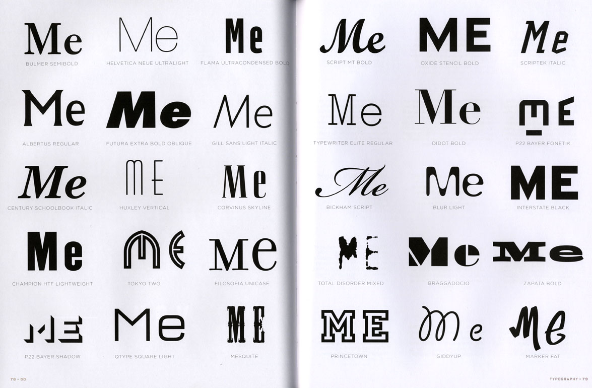
But assertions of circles’ alleged symbolism (to whom?) are unlikely to result in fresh vision. Quite the contrary. Cognition tyrannizes sight. To see form as form is to transcend what things mean; to look at line and shape and color in an almost militantly wide-eyed way. If you want people to discover form, don’t tell them what to see or what it means. Rather, ask them what they see. Ask them to compare one form with another, then another, and keep asking. Happily, sections of GO reflect this understanding. One of the most appealing spreads in the book is a very straightforward display of paired Ms, each comprising an upper- and lower-case character, typeset in thirty different typefaces. The letterforms are highly varied. The black letters on the white field provide sufficient variation to keep the viewer interested, and enough continuity to avoid distraction. It’s an extremely engaging moment, and it appears in the Typography chapter, the book’s strongest if its introductory ambitions are to be believed.
A little more editorial engagement from Workman would have served the project well. The text could have been whittled back by a third. I have not read either of Kidd’s novels, so I cannot comment on his fiction. But the text in this book is chatty and imprecise. In a passage about color that manages to be both maddeningly reductive and grammatically undisciplined, Kidd writes, “Warm colors…are about fiery emotion. They can express both anger and joy, which is kind of amazing. Each of those can be quite hot, actually.” Elsewhere he attempts to define pictogram, concluding, “Not like a generic emoticon, more like a logo.” These might seem like quibbles to some, because the book covers a significant range including an abbreviated history of graphic design. But GO reads a little like a celebrity project. Plainly put, the book does not suffer from an excess of rigor. This extends to the domain of fact-checking. At the risk of sounding provincial: early on, the reader is invited to consider the following sentence, from a disquisition on design as problem-solving which cites the example of the speed bump. “In 1953, Arthur Holly Compton, a Nobel Prize-winning physicist, became concerned about people driving their cars too fast past Brookings Hall, where he was a chancellor at the University of St. Louis in Missouri.” Followers of this publication may be prepared to give the publishers a pass on the fact Chancellor Compton was the, not a, holder of said office in 1953. Most will be less forgiving of the failure to correctly name the institution in question: Washington University in St. Louis.
Somewhat surprisingly, the book design for GO does not serve its young reader as well as it might. Chip Kidd’s work as a jacket designer has been highly influential, even epochal. But his strength in designing covers translates poorly to the interior reading experience. Almost every page or spread in GO seemingly aspires to be a poster. Kidd’s instinct to keep his young audience visually engaged is understandable. But moments of visual drama are best bracketed by formal quietude, and we get precious little of that. The frantic presentation of the book seems to suggest, like so much contemporary publication design, that the worst thing that can happen to a person is to be bored. In the immortal words of Charlie Brown, for whose creator’s biography Chip Kidd designed a killer cover: (Sigh.)
Chip Kidd has produced a useful book for young people with a budding interest in graphic design. It suffers from an excess of personality, both visually and textually. It will stimulate and motivate, rather than instruct. But meanwhile, the new model of designer-as-social-problem-solver (forward-looking, innovative, socially responsible, a bit messianic) continues to spread. The diversifying fields of design will only grow in influence. If graphic design, classically defined, occupies a smaller slice of design writ large, it will likely remain a point of entry to the bigger field. Call it a gateway drug. Meanwhile, we are short on engaging books which do the sensible work of helping young people envision credible futures for themselves. Thanks to the irrepressible, enterprising Mr. Kidd, we can add GO to that list.
GO: A Kidd’s Guide to Graphic Design by Chip Kidd, Workman Publishing, 2013.
160 pages with illustrations.
Paired concepts, somewhat frantically presented.
A particularly effective spread, from the chapter devoted to typography.


