2025 Errata for Stick Figures: the Optical Mode

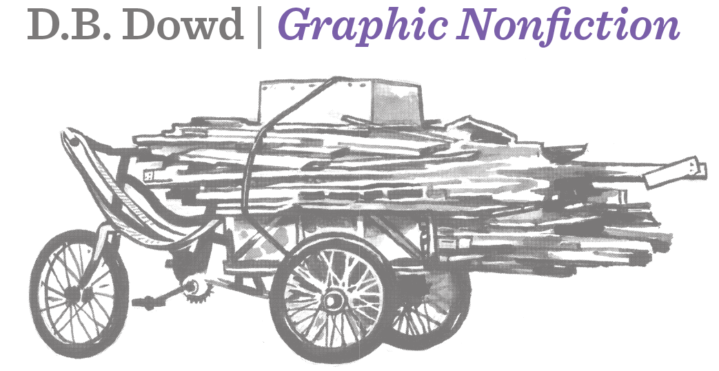
Fremont Petroglyph, Bighorn Sheep, Thompson Wash, southern Utah, circa 1000 CE, and Automobile Damage Schematic, St. Louis Tag Company, 2017.

Paul Klee, Ad Parnassum, 1932. This image is not in Stick Figures, but it demonstrates how the glyphic and optical modes can coexist in the same work. I first saw it in the flesh in an exhibition at the Cleveland Museum of Art in 1987.

On the Plain of Kasuga, woodcut illustration for Coming of Age, the first episode in the tenth century classic Tales of Ise, published by Suminokura Soan (1608-10). The first illustrated book printed in Japan. Hon'ami Koetsu’s calligraphy was used as a source for the moveable kana type, part of a short-lived experiment. Xylography prevailed after 1640. For our purposes, the work can be located within the glyphic mode and graphic sensibility.
I published the book Stick Figures: Drawing as a Human Practice in 2018. The project was designed to theorize under-considered aspects of drawing and printing; to reflect on vernacular visual culture; and to explore the relationship between illustration and cartooning. Viewed from a distance, it’s a book with a split personality. The first four chapters are strongly theoretical, the fifth addresses practice, and the sixth and seventh wade into the cultural history of American periodical publishing, among other things. To the extent it holds together, it might be unified by the spirit of impatience which brought it into being. As I wrote in the introduction “Stick Figures is a deeply ideological project.”
I have spent the last three years working on an ambitious undertaking which has kept me largely offline. The new book addresses “the history of illustration,” a subject about which I have expressed skepticism over the years. More to come on that before long.
But for now I want to return to Stick Figures to clarify something which has nagged at me for a long time. At root that book sought to define drawing beyond the Beaux-Arts tradition of illusion-making.
The images at left appear in Chapter 1 of the book to explain the concept of a hieratic image, or one which does not admit the problem of point of view: We are able to see both horns on the sheep and both sides of the vehicle because each composer had a reason to show the subject thusly. The animal looks like this, but you need to see all its parts (including cloven toes) at once. The sedan appears flattened because we need to document all its dings and dents in a single image if we’re to complete this car rental.
The discussion of hieratic images helps to develop the concept of the glyphic mode, which (in Chapter 2) is paired with the graphic sensibility. These ideas are distinguished from a competing tradition, associated with the history of painting, which I dubbed the vedutic mode, paired with the painterly sensibility. The concept of the painterly gives way to photography and cinema.

I struggled for a long time to find the right language for the counterpart to the glyphic mode. I got “vedutic” from the Italian veduta or view, to convey the idea of a vista, like looking across the Grand Canyon. I was seeking to capture the experience of atmospheric vision, of simulated immanence, which we associate with the Hudson River School, etc. Vedutic always felt forced—mannered, possibly silly—as a coinage, but it was the best I could do at the time.
By contrast, glyphic always made perfect sense. The idea of a glyph (a specialized usage as I noted in the book, an integer of symbolic form) could be made by anyone with a simple tool. The unit or “atom” of the glyphic mode (as shown in the table above, from section 1.3 on page 17) is the calligraphic stroke; the basis or “molecule” is the glyph itself—a character, symbol, or pictograph. It followed that application was direct, and the ground was tabular.
As I look back at the table now, I see that the unit or “atom” for the opposing mode was and remains correct—the daub of paint, the grain of photography, the dot of a halftone, and the pixel of computing. The basis or “molecule” is also roughly correct if inelegant: the spritz captures the act of blowing paint through a prehistoric bone: an indirect effect.
As a concept, the problem at the mode level is this: the term vedutic is frankly erroneous. It gets at what the result is like, not what the approach does. On some level I have known this for at least five years. But the logical mistake never crystallized.
Last Saturday, on February 1, 2025, while taking a shower, the correct term came to me out of the blue: optical. The opposite of the glyphic mode is the optical mode. The daubs and dots and pixels produce optical experiences.
I printed 2000 copies of Stick Figures. Very few remain. If I could I would print an errata notice and tuck it inside every copy to say the the reader should substitute OPTICAL for VEDUTIC in the table reproduced above.
As I am coming out of the tunnel of the new book teased above, which has influenced my thinking on related subjects in powerful ways, I believe that the theoretical chapters of Stick Figures (particularly 1-4) informed by subsequent work suggest a fruitful path.